Harmonizing colors all through graphics, text, and images highlight and clearly express the different flavors.
Harmonizing colors all through graphics, text, and images highlight and clearly express the different flavors.
Harmonizing colors all through graphics, text, and images highlight and clearly express the different flavors.
Harmonizing colors all through graphics, text, and images highlight and clearly express the different flavors.
Harmonizing colors all through graphics, text, and images highlight and clearly express the different flavors.
My role:
Designer
What I did:
Photoshoot / Packaging design
Agency: BAS ID
Design Director: Stefan Sundström
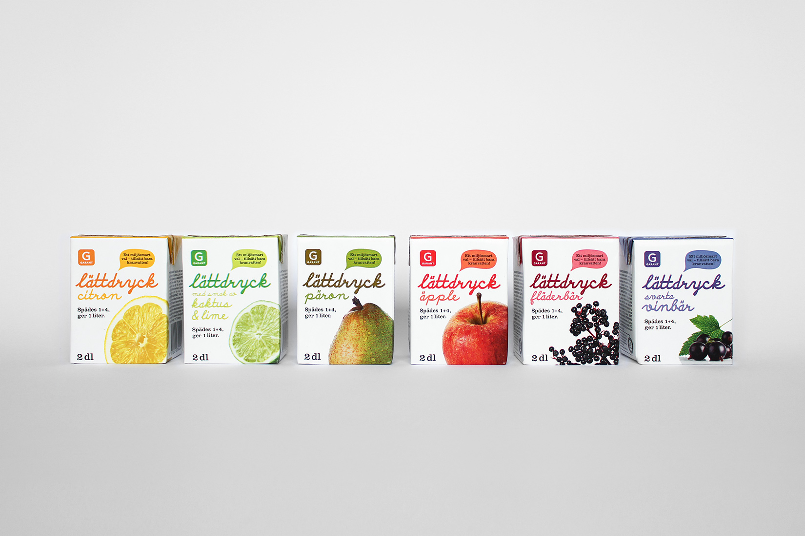
Axfood is Sweden’s second largest food retailer. Garant, which is an own-label product of Axfood, sells high-quality goods at a low price. Every product range has its own unique design, which Garant is known for. At BAS together with Stefan Sundström, I made the packaging design for the range of fruit drinks.
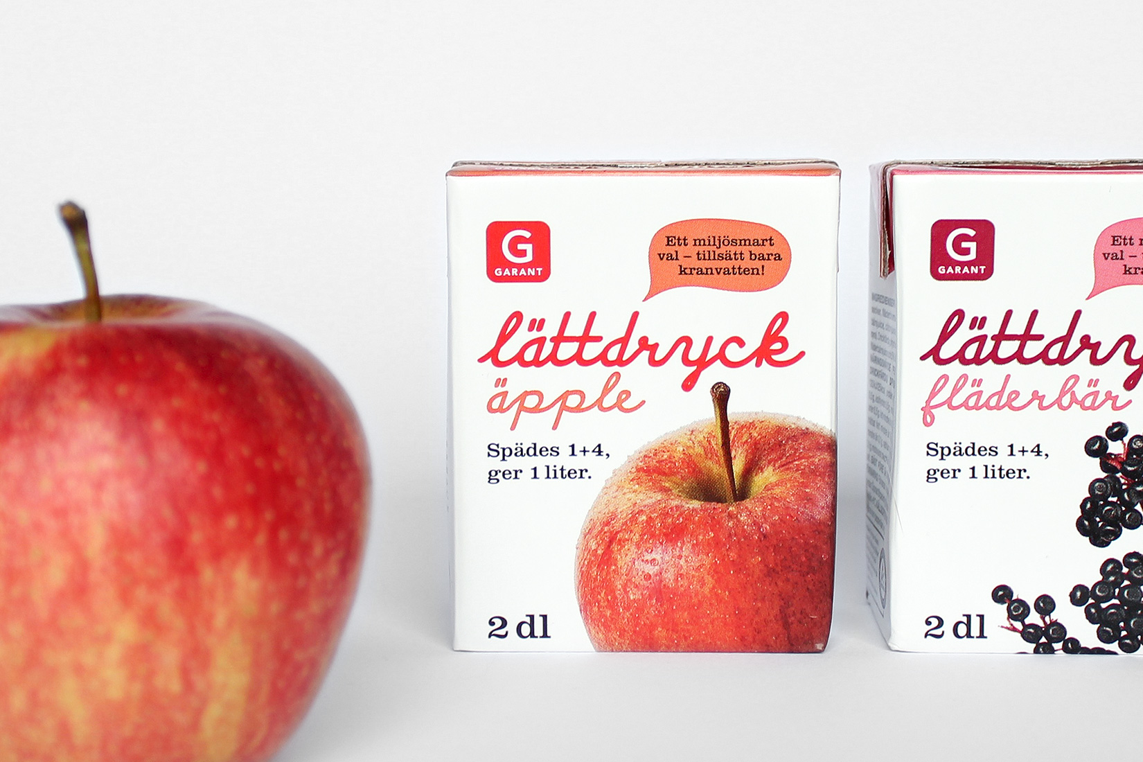
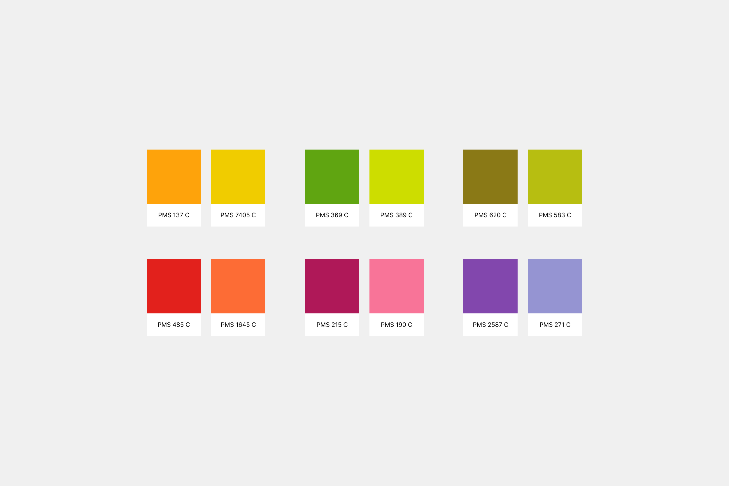
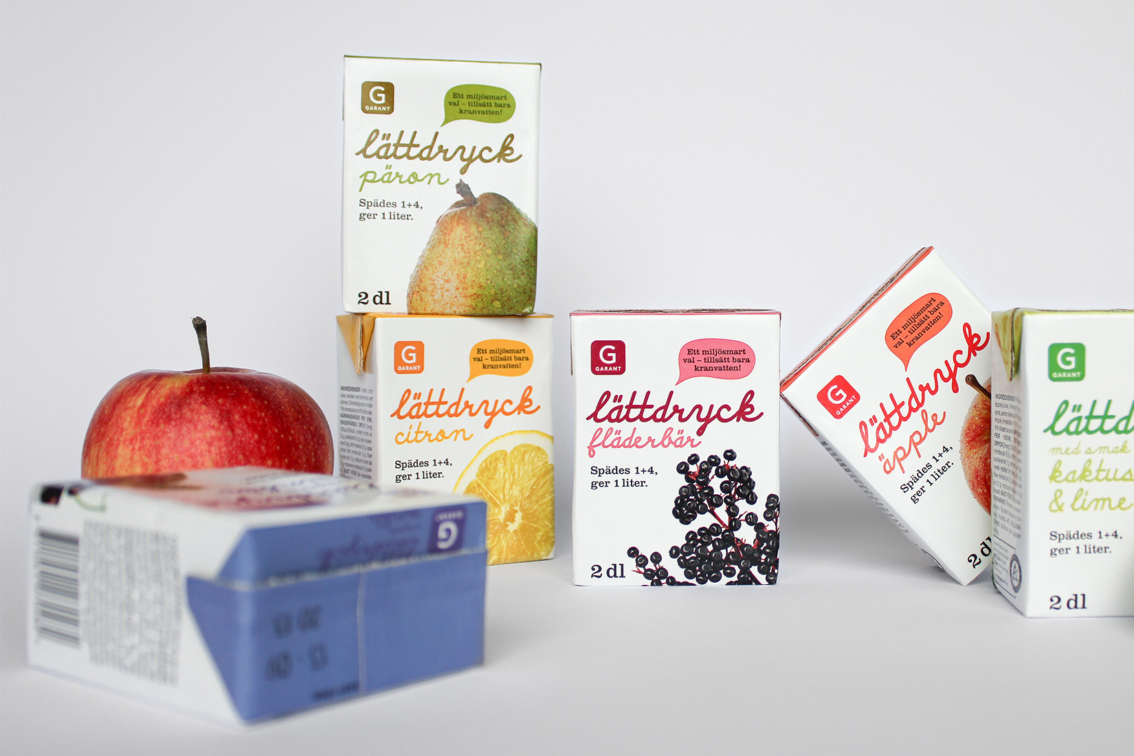
The images of the fruit make the base of each design. In the photoshoot, we made sure that the fruit looked fresh and tasty. The colors of the typography and graphics are close to the nuances in the images – but tweaked to harmonize and be legible. The script typeface Discipuli Britannica is used to unify all the fruity food packaging from Garant.
Axfood is Sweden’s second largest food retailer. Garant, which is an own-label product of Axfood, sells high-quality goods at a low price. Every product range has its own unique design, which Garant is known for. At BAS together with Stefan Sundström, I made the packaging design for the range of fruit drinks.
The images of the fruit make the base of each design. In the photoshoot, we made sure that the fruit looked fresh and tasty. The colors of the typography and graphics are close to the nuances in the images – but tweaked to harmonize and be legible. The script typeface Discipuli Britannica is used to unify all the fruity food packaging from Garant.