A bold logotype was an obvious choice. The wide typeface also conveys knowledge, confidence and experience.
A bold logotype was an obvious choice. The wide typeface also conveys knowledge, confidence and experience.
A bold logotype was an obvious choice. The wide typeface also conveys knowledge, confidence and experience.
A bold logotype was an obvious choice. The wide typeface also conveys knowledge, confidence and experience.
A bold logotype was an obvious choice. The wide typeface also conveys knowledge, confidence and experience.
My role:
Design Director & Designer
What I did:
Visual identity / Brand guidelines / Web design / Animation / Design applications / Social media templates
Copywriter: Rickard Netsner
Complementary web development: Julius Mattsson
STARK is a Swedish creative film agency with a global reach and over 30 years of experience. A few years ago they merged with another film agency, Oddway. This, along with the opening of a new office in Stockholm, led to a rebrand.
The newly merged STARK wanted to be seen as more creative while maintaining their professionalism and trustworthiness. Since STARK means strong in Swedish, a bold logotype was an obvious choice. The wide typeface also conveys knowledge, confidence, and experience.
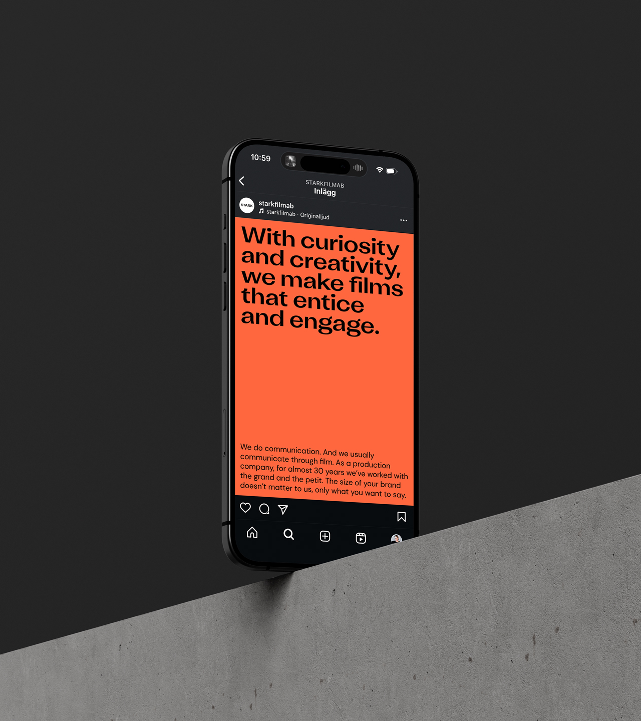
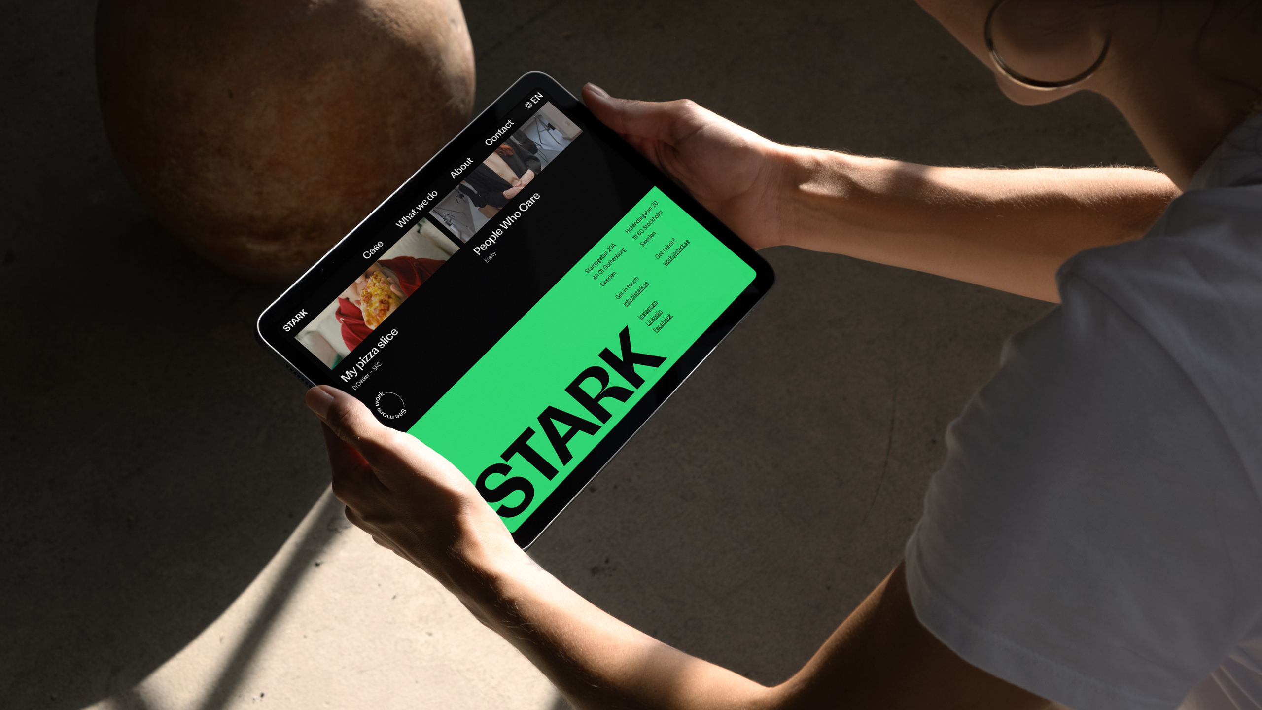
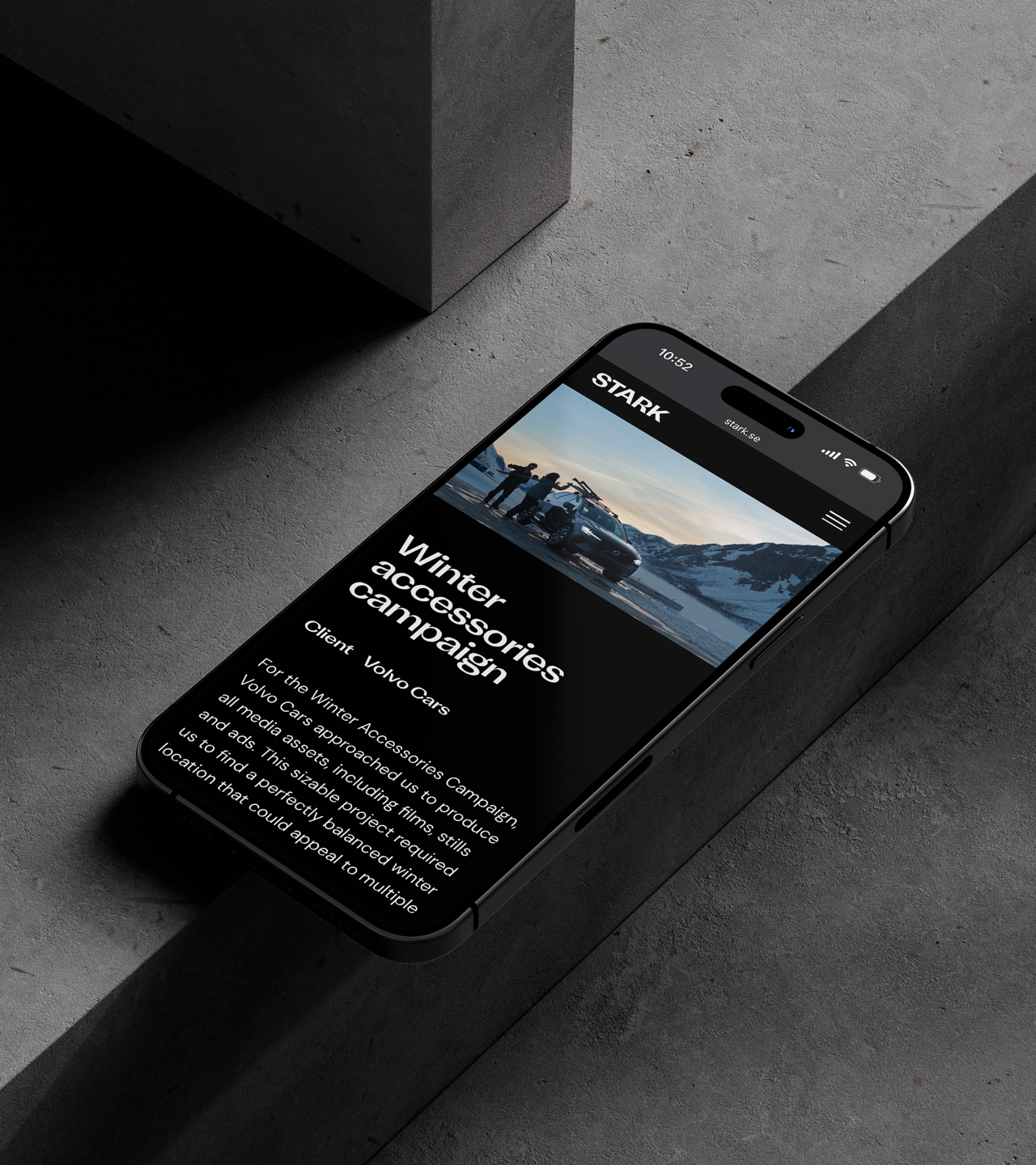
The visual identity stands out with a pop of color, setting it apart from the mostly black-and-white brands of other film agencies. The design also makes deliberate use of whitespace and tight margins in the layout.
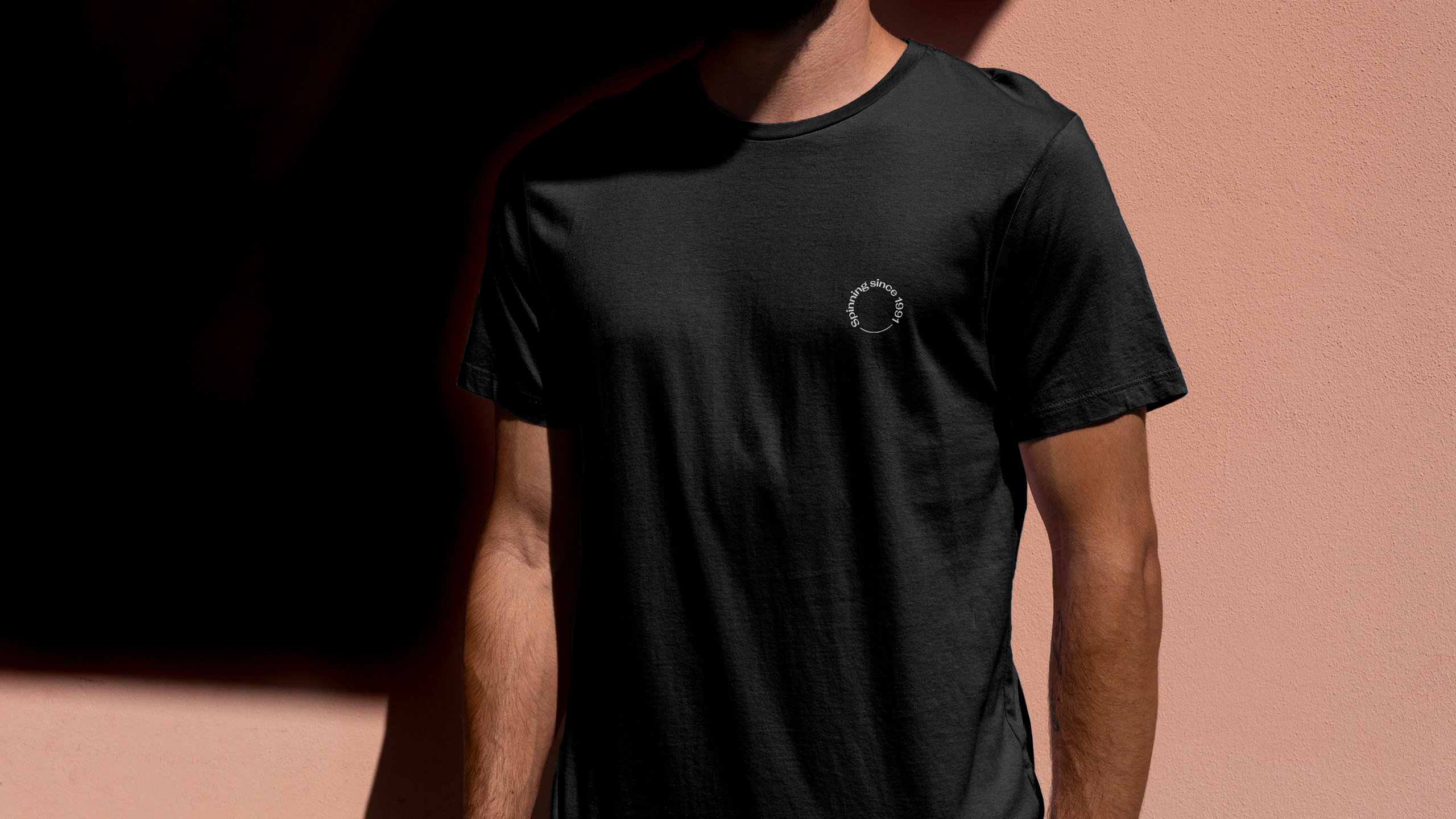
For short messages, spinners were incorporated as a nod to the classic spinning film reel.
STARK is a Swedish creative film agency with a global reach and over 30 years of experience. A few years ago they merged with another film agency, Oddway. This, along with the opening of a new office in Stockholm, led to a rebrand.
The newly merged STARK wanted to be seen as more creative while maintaining their professionalism and trustworthiness. Since STARK means strong in Swedish, a bold logotype was an obvious choice. The wide typeface also conveys knowledge, confidence, and experience.
The visual identity stands out with a pop of color, setting it apart from the mostly black-and-white brands of other film agencies. The design also makes deliberate use of whitespace and tight margins in the layout.
For short messages, spinners were incorporated as a nod to the classic spinning film reel.